Stylish Wheelchair Accessible Crosswalk
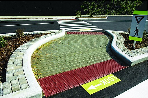
Recently I featured a case in the Bad Design Style series of some crosswalks in Minnesota that were not done properly. The island medians had no cut through path. Some of the marked paths even went around the median into the path of traffic! All ADA violations. Needless to say those planners could’ve learned a thing or two from this example. A wheelchair accessible crosswalk with style.
Function First
Before we get into the style, let’s look at the function. The cut through path is level with the street and plenty wide. Even with the curves, there is no feeling of having to maneuver a lot because of the wide path. Then there are truncated dome surfaces at each end of the path so that people who are blind can feel and know where the edges are. The “LOOK” and yield signs are clear but not cluttered or distracting.
Now Form
Now for the look. The curves in the path are gentle and give visual interest without affecting function. At the edges of the surrounding medians are brick cobblestones. This look is mimicked in the path surface. Maybe a little bumpy but still accessible. I’m sure when in full bloom the vegetation and flowers in the median also look great. Finally the bright colors of the signs and truncated domes give a nice accent pop visually. While also giving contrast which is easier to see.
Conclusion
Not every crosswalk needs to have the visual beauty of this one, but they should definitely have the same functions.

