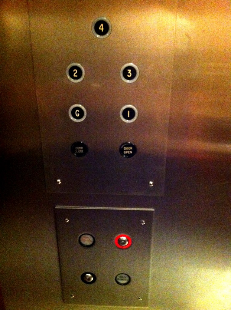
Bad Design Style: Case #34

That’s a nice looking elevator panel there. Buttons are organized and the shiny metal is attractive. Oh but now close your eyes before entering and try to figure out what button is which. Well without the required Braille and raised tactile characters, it’s a bit of a guessing game.
This elevator control panel is in an apartment building with the elevators being remodeled within the last ten years. Accessibility design laws for apartment buildings can be muddled because of different guidelines (ADA, ABA, UFAS, Fair Housing) and grandfathering. Because this elevator is part of a commons area, was recently renovated, and is privately owned; I believe it should be covered under the ADA. In which case the buttons should have corresponding Braille and raised tactile letters and numbers. Both the property owners and elevator renovators should’ve known this.
