Bad Design Style: Case #24

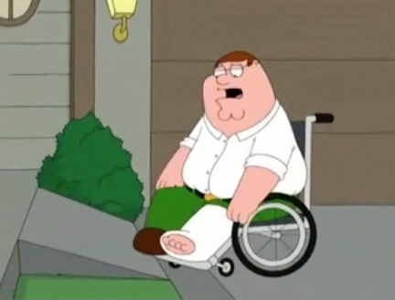
During my college years and initial post college years I was a regular watcher of Family Guy. I have since grown out of the show but do remember this particular scene. This is the front entrance ramp of character Joe Swanson who is a wheelchair user. And it’s not one that would be very functional or safe in real life. Now I don’t expect a cartoon that strives to insult everyone equally to draw out a proper ramp. But I still want to point out the flaws and discuss public perceptions of what’s wheelchair accessible.
*(Arguments can be made as to whether this episode was straight insulting to people with disabilities or if it had an underlying positive message. I’m not going to delve into that topic and just talk about the ramp. After all this is a design blog!)
Yes I Know It’s a Cartoon But Here’s What’s Wrong
The episode itself is about Peter and his family starting a restaurant but banning people with disabilities. He ends up becoming a wheelchair user himself and at the end visits his neighbor Joe to apologize. Which is this scene. Obviously the ramp is way too short and steep. Again I know this is a cartoon but I’m going to estimate that’s an 8 inch rise, with a 3 foot long ramp. No way in real life could someone go up this ramp with the ease Peter does. Then there are no side guards or railings to prevent a drop off the side.
Public Perceptions
I work regularly with ramps and wheelchair users, which is why I noticed this ramp flaw so quickly. I’m sure many wheelchair users saw the same thing right away. But most of the public probably saw nothing wrong and would assume a ramp like that would work in the real world. Which is why we see some of the other ridiculous ramps in other Bad Design Style cases. Shows how much of the public is still unknowledgeable about accessible design.
